Paint on the Summer
Summer time is one of our favorite times of year. We spend our time lounging in the sun, golfing, reading and playing in the lake. We take advantage of the scenery outside and spend our days exploring and hosting backyard barbecues. We play! Isn’t that what summer is for after all? Aside from the summer fun, we work a lot. Not only are we at the showroom six days a week (sometimes more depending on the projects at the time), but summertime is also the time we do most of our own house upkeep. Our wood projects get done, our house gets a fresh coat of paint, and our lawn continues to supply us with yard work out the wazoo. And if you’re like us – you float through the season the same way spending your days half-working and half-playing.
The fact of the matter is, because it is warmer, we tend to get more work done in and on our houses in the summer months. We all get moving when the dreary gray finally passes and it’s crystal clear for a couple months. So, why not capitalize on the season and use those warm days to enlist some summer colors into your home? Maybe they will just inspire you to keep moving all year long.
Read on for some of this season’s more noteworthy summer colors and open up those windows and grab your paintbrushes.
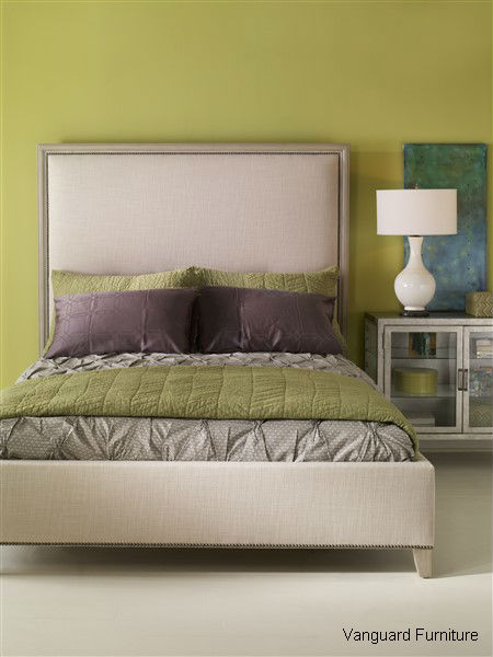
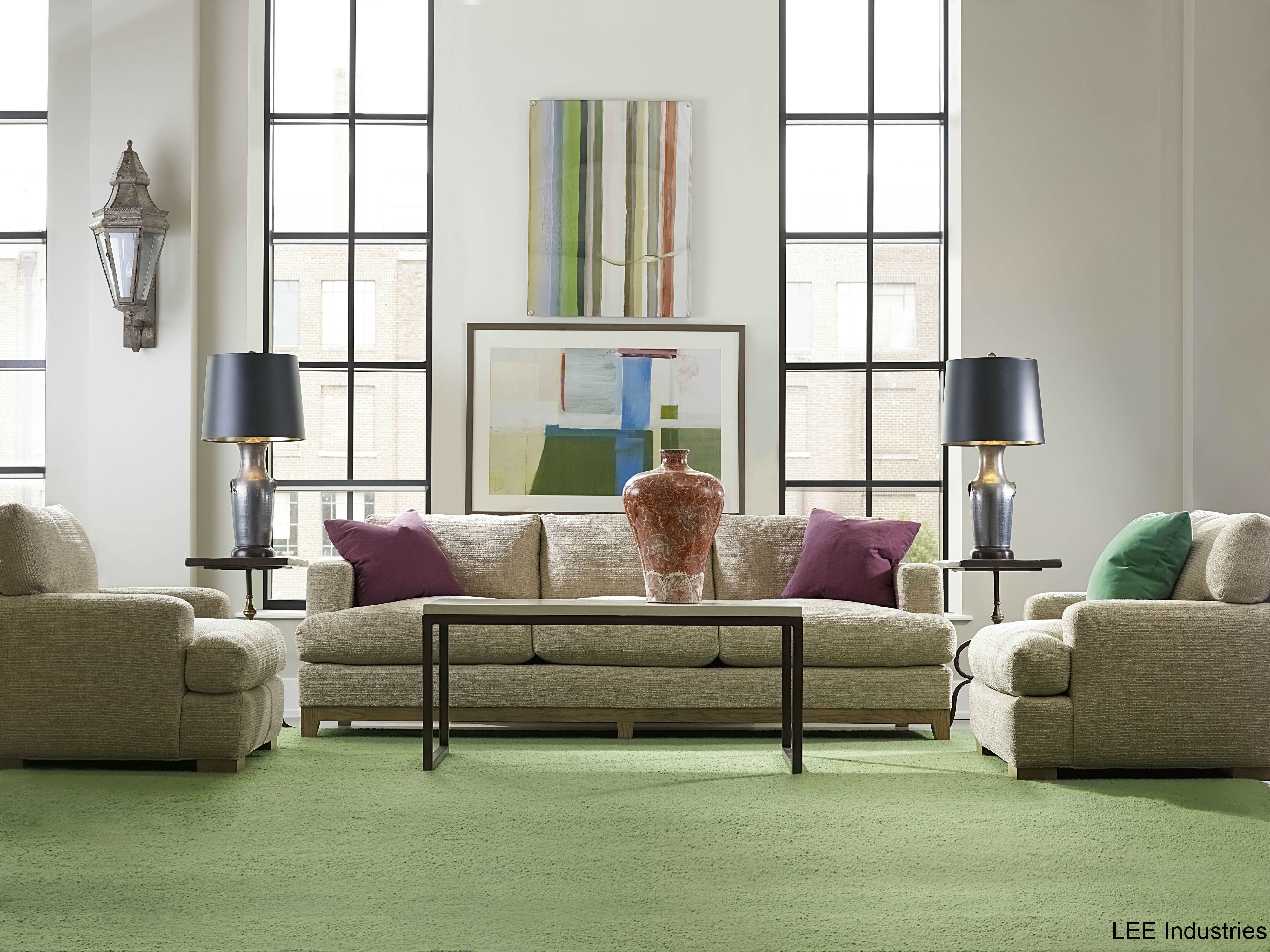
Tried and True Whites – Whites work well in any season, but particularly for summer they are the winner of all colors. Why? Because white is airy, clean and crisp. The hue works well in any design scheme whether it be modern or rustic/chic and can be paired with absolutely every color on the wheel. Note the bright green in the picture below. There is also something about white that reminds us of the coast. Think nautical thoughts and sandy beaches… what better color for summer play then?
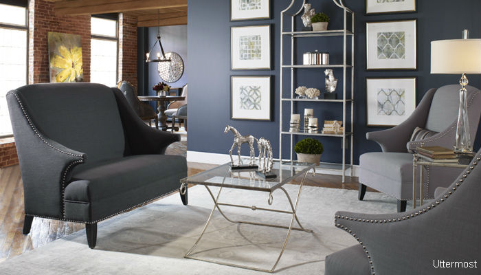
Cool Blues – Another staple of summer, different shades of blue play up to the fun, water life we live here around the Flathead Valley. Pair dark steely and navy blues with vibrant teals and pastels for a serene and relaxing environment. Don’t be afraid to branch out and paint your walls a navy shade as when paired with bright neutral colors, the blue stands out and creates a rich contrast. The lighter palette in turn makes for a more tranquil environment for your lounging around summer days.
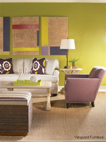
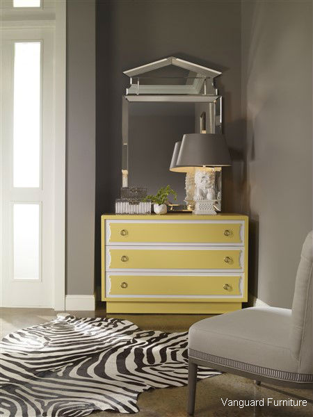
Simple Grays – Now that the clouds of winter have passed and we only see blue skies ahead, summer allows for us to welcome grays back into our homes. A popular color choice, shades of gray are similar to white in that other contrasting colors can be easily paired with it. We love pops of yellow against light gray walls (see the picture below) and even have an employee here at Ciao who just painted a room in her house a silver spoon light grey with coral accents. Pinks, blues, greens…the combinations with gray are endless. Paint on a darker tint for a more serious and modern design or choose a lighter gray for a fun, relaxed, shoes off kind of environment.
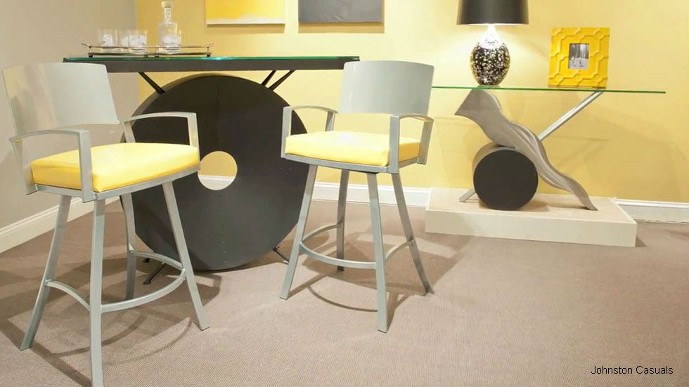
Poppy with Yellows – Who doesn’t love a good yellow? What used to be an unpopular paint color, yellow has made a comeback in a massive way. Don’t be shy of the vibrant hue. If painted on correctly, yellow will brighten up any room as well as your mood. Pair the color with lighter hues like gray and white to help tone down the intensity. Dark greens against the palette will help the hue reflect a more golden tint and blush pinks will create a more luxurious and softer atmosphere. Not sure about doing a whole wall? Paint the color on to an old dresser or incorporate it in with accent furniture. The poppy color will refresh your spirit and get you up and moving.